![Ticket Mockup].png](https://static.wixstatic.com/media/2c7ef5_cc4acf96e3fa4124a3eb7518b3556169~mv2_d_3000_2000_s_2.png/v1/fill/w_676,h_450,al_c,q_85,usm_0.66_1.00_0.01,enc_avif,quality_auto/Ticket%20Mockup%5D.png)
Selected project
01
EVERLAND
- brand concept
- innovative prototype
- strategic thinking
A brand concept design for an imaginary project —a planned community on Mars
WHERE YOUR DREAM COME TRUE
ever!and is a planned community on Mars for dreamers and adventurers who are 55+ years old, because people deserve to dream and achieve it in their precious lifetime. Now, stop imagining what life is out of the earth. No more imagination! Achieve your dream on Mars!
The brand name ever!and is inspired by Neverland in Peter Pan. Compared with neverland, ever!and is the actual place where dreams come true. The whimsy collage will trigger dreamers'
curiosity and join the adventure to Mars.
Characteristics: adventure, whimsy and imaginary


Simple website design

BRUNEI
02
Selected projects
- brand identity
- visual language
- design direction
A brand idenity project for Brunei, a Southeast Asia country, with a concept of lens of yellow
THROUGH LENS OF YELLOW
In Brunei, yellow represents the Sultan of Brunei, which is the country’s most vital essence, and the color yellow also symbolizes the culture of one of the wealthiest countries in the world. Yellow is a meaningful and spiritual color for Bruneians because they believe in Sultan, who will lead Brunei to a better world.
In the branding for Brunei, the color yellow will blend throughout the storyline and bring audiences into the culture of Brunei through the lens of yellow, the eye of Brunei.
Characteristics: Royal, Spiritual, Blessed

MAIN LOGO

SUB-LOGO
LET THE MYSTERIOUS CULTURE ACTS AS AN INVITATION TO TOURISTS
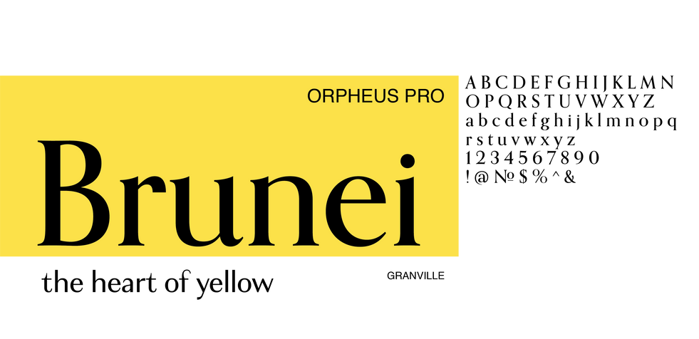
Logo design without any decorations creates a contrast to the Flag of Brunei. It works as an invitation to attract people's interest, and let people wonder what kind of country Brunei is.
An Islamic country in South East Asia?
For the "Brunei tourism" logo, I decided to outline the silhouette of Omar Ali Saifuddin, an Islamic mosque, because, in my opinion, understanding the country's religion is one of the best ways to get to know the people, the heart of the country.
On the other hand, I chose to use oil well as the silhouette of the business logo. I hope the logo can not only show its oil culture but also show Brunei's financial power; how a small country was named the 3rd largest oil producer in Southeast Asia with a GDP of $77,000 per capita.


MTA
03
Selected projects
- brand strategy
- system thinking
- design prototype
A rebranding project connecting MTA and New Yorkers through art
ART IS EVERYWHERE
This project is a rebranding project for MTA. It aims at creating a new identity that connects MTA and New York. The mission is to issue the negative brand image of MTA and endow a new identity to MTA which has not changed for almost 50 years.
MTA is an everywhere gallery for busy New Yorkers who appreciate art because we believe people deserve to enjoy art anytime, and art is everywhere.
Characteristics: Avantgarde, bold and modern

LOGO
INSPIRED BY THE SILHOUETTE OF THE METRO CARD
A KEY TO NEW YORK
MTA is not just a public transportation tool that brings passengers from A to B, but also brings culture from a neighborhood to others.

AN EVERYWHERE GALLERY
Art takes effort to be discovered,
but once you start to look at the world from different angles.
Art is everywhere.


